Simple guide on how to draw a paper sketch example: Uizard’s AI scanner
Here is a simple, clear guide on how to draw a paper sketch so that Uizard’s AI scanner converts it into an editable digital screen perfectly. The AI scanner can read it perfectly without any errors.
To help the AI read your sketch without confusion, follow these 3 simple rules:
Use a black pen or fine liner: Do not use pencils or light-colored pens. High contrast helps the AI detect edges.
Draw on plain white paper: Avoid lined or grid paper. Lines confuse the AI, causing it to see fake borders.
Keep elements separate: Leave a tiny bit of white space around every button, input box, and icon. Do not let lines overlap.
🔤 The Standard AI Drawing Symbols
Uizard’s AI recognizes standard UI shorthand symbols. Use these exact drawings on your paper:
Image Placeholder: Draw a rectangle with an “X” from corner to corner inside it.
Button: Draw a clean rectangle and write a single word inside (e.g., “Login” or “Buy”).
Text Paragraph: Draw 2 or 3 straight horizontal parallel lines to represent a block of text.
Input Field (Forms): Draw a long, thin rectangle. Inside it, write a short label in lowercase (e.g., “email”).
Icon: Draw a small circle or a simple square with a basic shape inside (like a cross or a triangle).
📸 How to Take the Perfect Photo
Once your sketch is ready, the way you take the picture is critical for the AI scanner:
Keep it flat: Place the paper on a flat table. Hold your phone directly above it—not at an angle.
Bright, even lighting: Avoid casting harsh shadows with your hands or phone. Natural daylight is best.
Crop the edges: When uploading to Uizard, crop out the table or your fingers. The AI should only see the white paper.
🧠 3 Effective Prompts You Probably Haven't Heard Of Yet
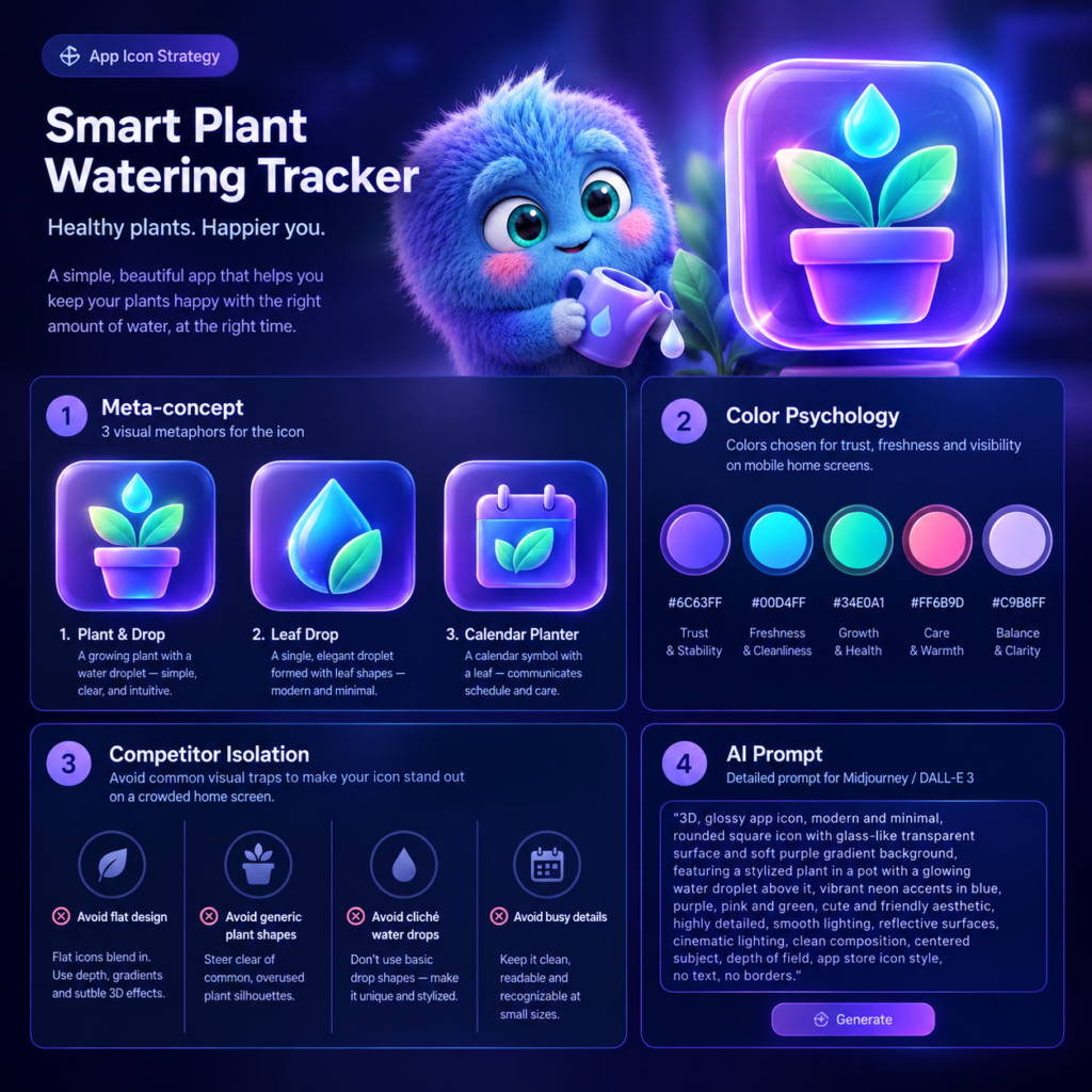
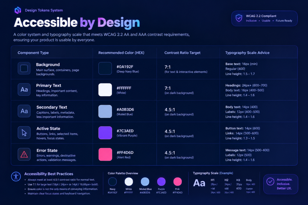
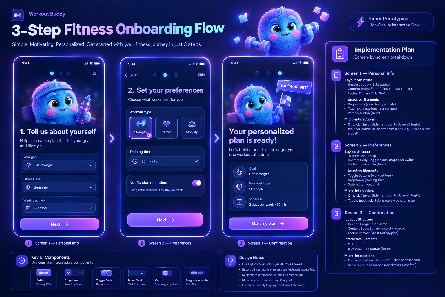
Here are three ready-to-use structural text prompts for ChatGPT to help you build a complete App Icon Strategy, create Accessible Layouts, and use Uizard components to build your prototype fast.
📱 Prompt 1: App Icon Strategy Generator.
Act as an expert Branding and UI Designer. I am building a mobile app for [insert app idea, e.g., a local plant watering tracker]. Generate an App Icon Strategy. Provide: 1. Meta-concept: 3 distinct visual metaphors for the icon. 2. Color Psychology: Specific HEX codes optimized for App Store visibility. 3. Competitor Isolation: What visual traps should I avoid to stand out on a user’s home screen? 4. Prompt for AI: Write a detailed, technical image prompt for Midjourney/DALL-E 3 to generate this icon base.
🎨 Prompt 2: Accessible Layout & Contrast System (WCAG Guide) Goal: Ensure your generated layout passes legal accessibility tests (WCAG 2.2 AA/AAA) before you run a heatmap test.
Act as an Accessibility (A11y) UX Consultant. I am designing a web dashboard that uses [insert primary color, e.g., Deep Navy Blue #0A192F] as its main theme. Provide a Design Tokens System that satisfies WCAG 2.2 AA and AAA contrast rules. Output a Markdown table containing: – Component Type (Background, Primary Text, Secondary Text, Active State, Error State) – Recommended HEX color code – Minimum contrast ratio target (e.g., 4.5:1 or 7:1) – Typography scale advice (font weight and minimum readable size in pixels)
⚙️ Prompt 3: Uizard Interactive Component Map. Goal: Plan out exactly which native interactive blocks you need to drop onto your digital canvas to make your wireframe feel real.
Act as a Product Designer specializing in rapid prototyping. I want to build a high-fidelity interactive flow for [insert workflow, e.g., a 3-step fitness onboarding process]. Create an implementation plan using standard UI components. Break down each screen into: 1. Layout Structure: Header, Content Body, or Footer placement. 2. Interactive Elements: Specific interactive components needed (e.g., toggle switches, dropdown accordions, input fields). 3. Micro-interactions: Define exactly what happens when a user clicks the main CTA (e.g., opening a modal, triggering a snackbar notification, or slide-left transition).